
Case study·Lifestyle·Heart health
Rhythmia Care
A calm, credible brand for an all-in-one heart supplement developed by UK cardiologists.
- Competitor Analysis
- Brand Positioning
- Brand Identity
- Personas & Tone of Voice
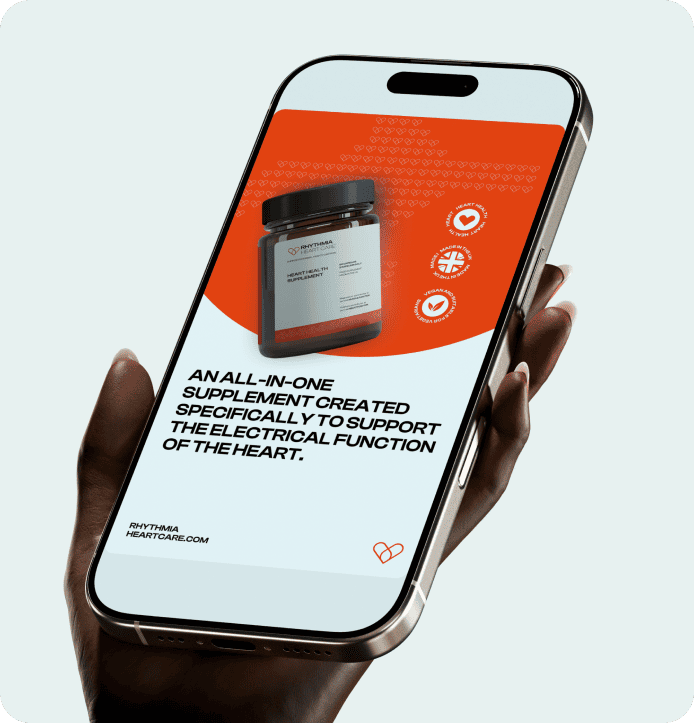
- Packaging Design
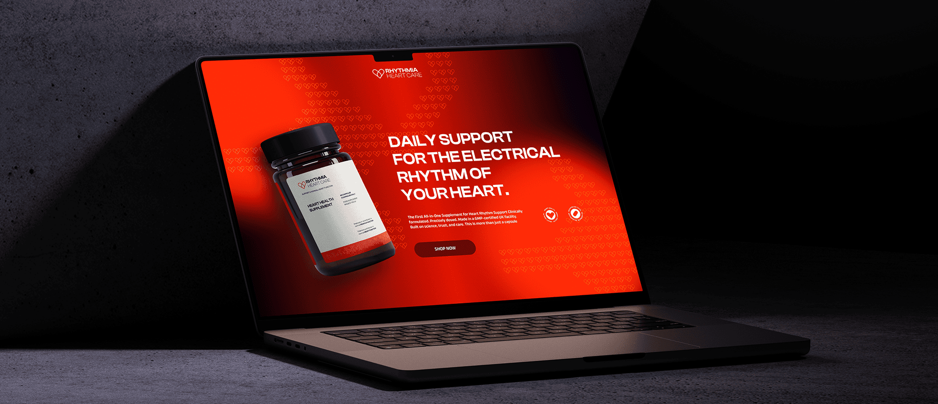
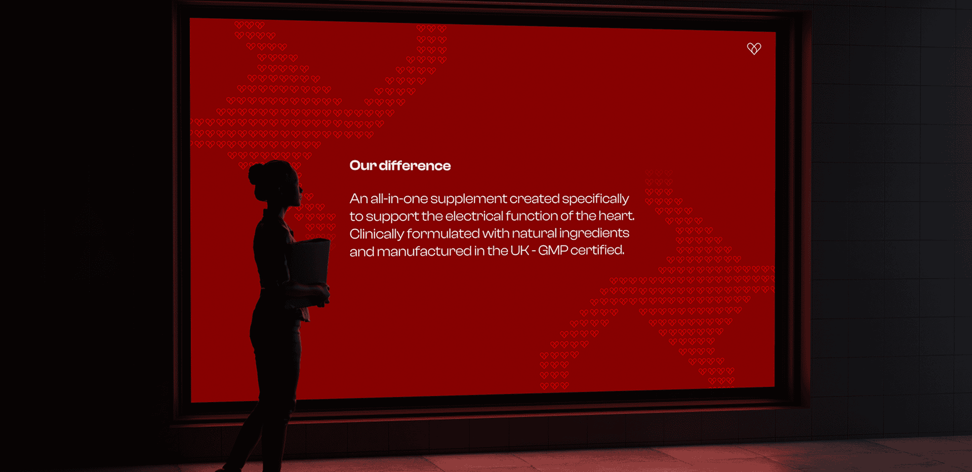
The difference
All-in-one
heart support
When the team first came to us, the challenge wasn’t the product but how to position it. We carried out a full competitor analysis to understand how the wider heart-health space behaved and where the genuine opportunity sat. The category is busy, but very few brands speak directly to rhythm-related concerns. That distinction helped define their “Difference” and gave us a clear foundation for building a brand rooted in reassurance, credibility and purpose.
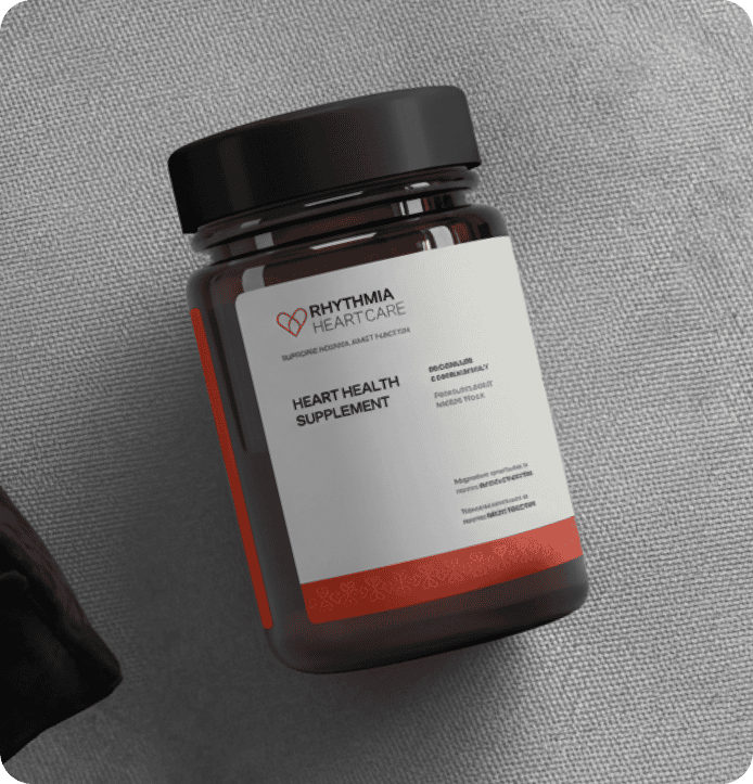
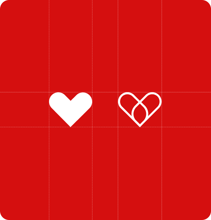
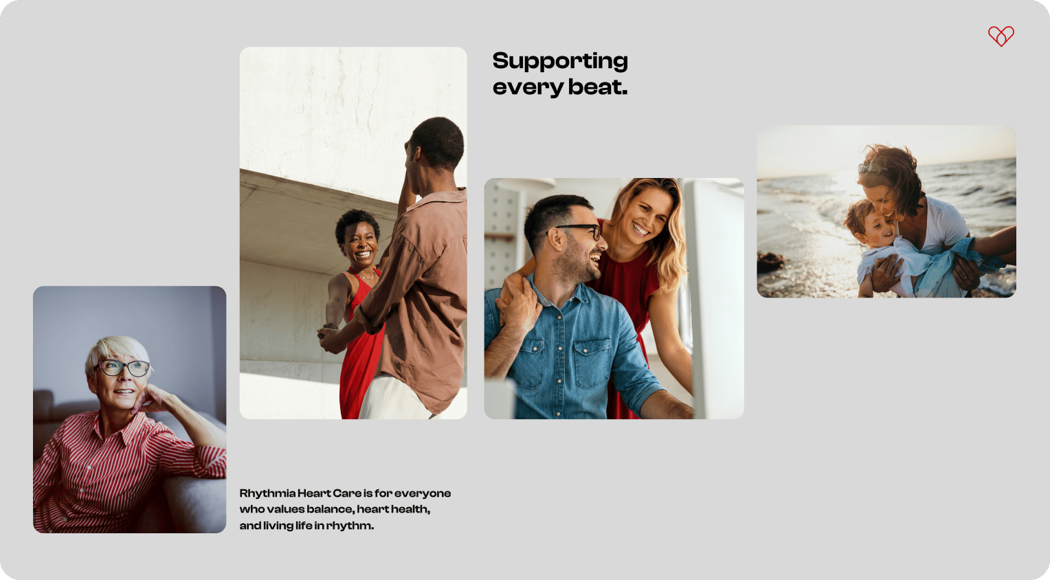
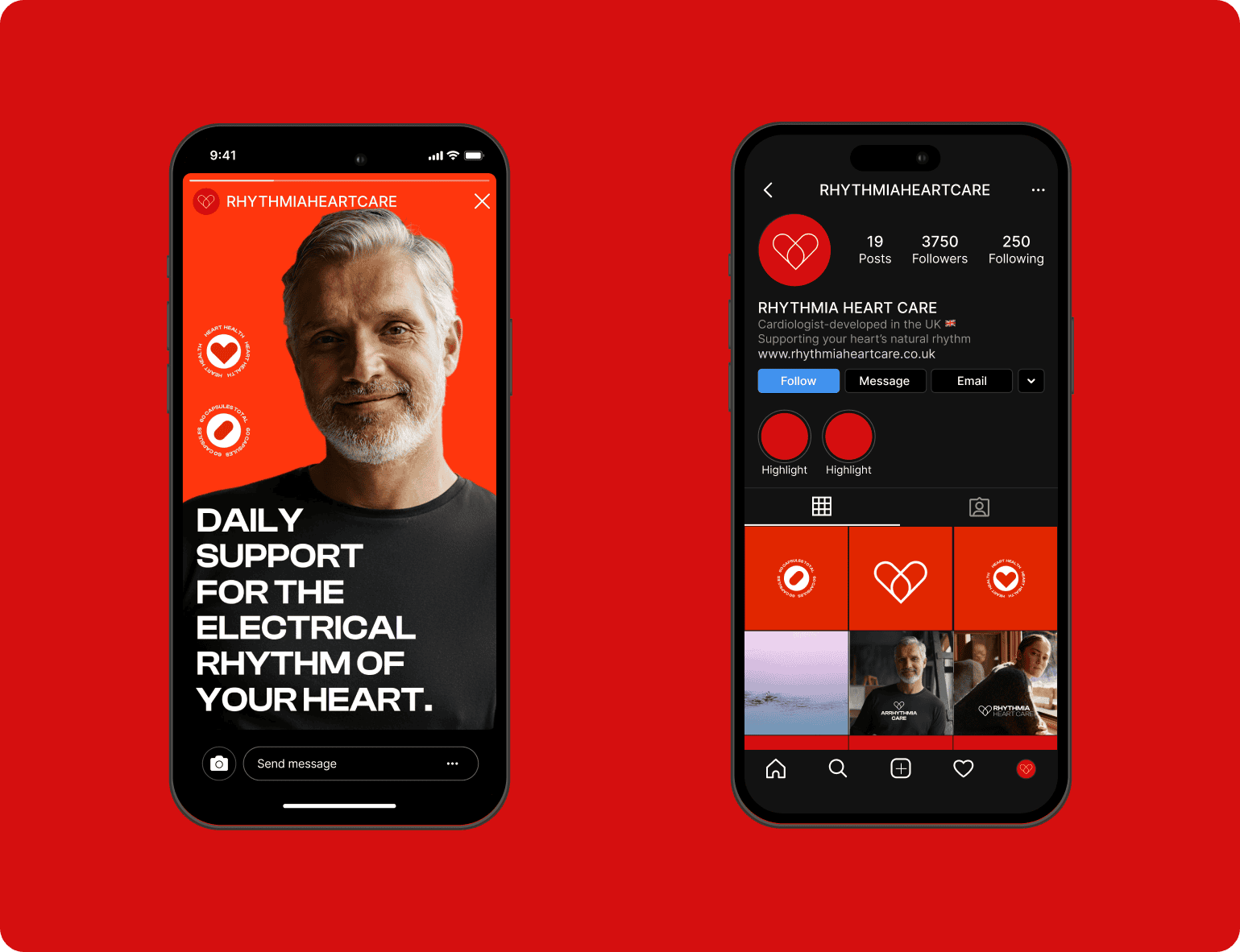
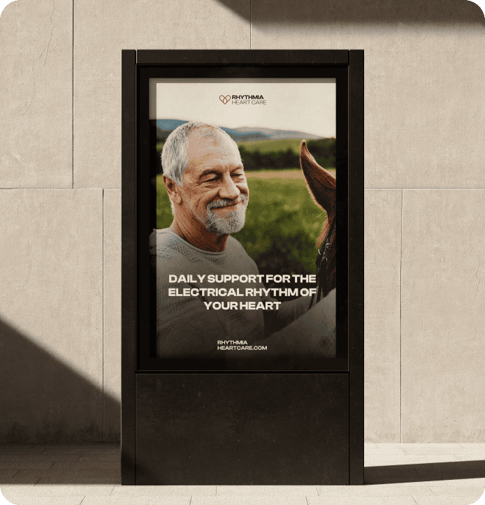
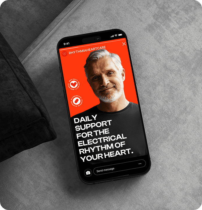
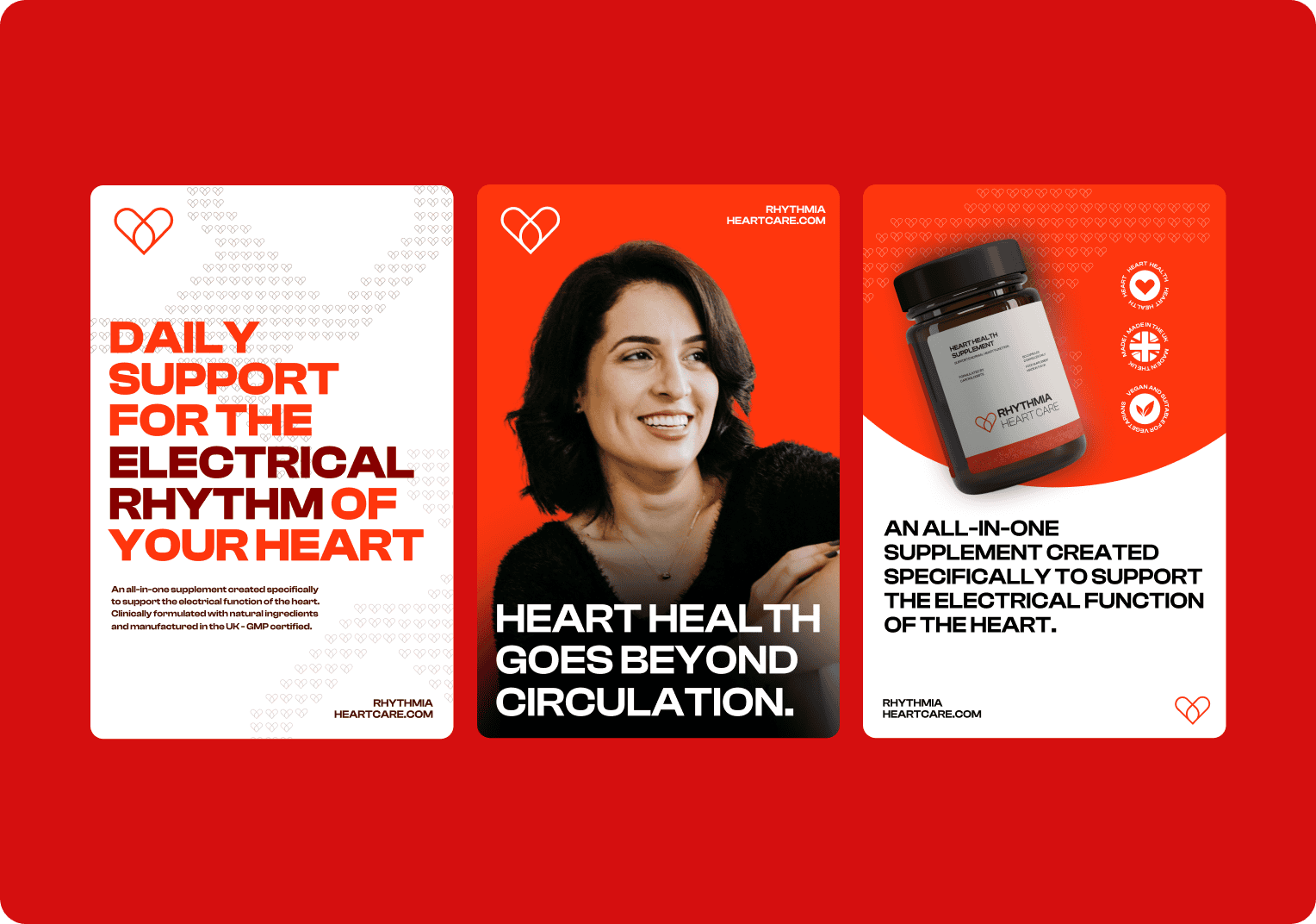
With their positioning set, we developed an identity that feels calm and grounded, giving people clarity without leaning into an overly-clinical tone. Through audience research and persona building, we shaped a voice that speaks to individuals who want support they can understand and trust. Typography, colour, imagery and an evolved logo were refined to create a visual system that feels warm, steady and aligned with the care behind the product. Their new branding was applied across packaging and real-world scenarios so the team could see how Rhythmia Heart Care would live both online and on the shelf. It gives them a clear and confident platform to bring the product to market and speak directly to the people it was designed to support.
- Developed byUK cardiologists
- FocusRhythm-related concerns
- FormulaAll in one
The brief
Position a heart supplement in a busy category where very few brands speak to rhythm-related concerns.
Our approach
Reassurance, credibility, purpose
A full competitor analysis showed us where the genuine opportunity sat, and gave us a clear foundation for the brand.
- 01
Research
Competitor analysis, audience research and personas.
- 02
Identity
Calm and grounded without feeling clinical.
- 03
Visual system
Typography, colour, imagery and an evolved logo.
- 04
Application
Packaging and real-world scenarios, online and on shelf.
The detail
It highlighted a clear gap in cardiac support: nothing existed that focused specifically on the heart’s electrical function in a simple, reliable way. This led to the first all-in-one formula designed for people concerned about rhythm disorders – clinically formulated, precisely dosed and made in a GMP-certified UK facility. With the product ready, the team needed a brand that could introduce it to the right people with clarity and confidence. And that’s where Rhythmia Heart Care began to take shape.
Want a brand like Rhythmia Care?
Tell us about your brand and we’ll come back within one working day. Or skip the form and speak to us now.

Insights
All insights → SupplementsThe Essential CRO Checklist for Supplement BrandsIt’s easy to assume that increasing sales means attracting more visitors to your supplement brand, but that’s only…Read the article →
 Supplements7 SEO Mistakes Costing Supplement Brands SalesSEO is one of the most effective ways for supplement brands to attract new customers, but it’s also…Read the article →
 SupplementsAre Supplement Subscriptions Worth It?Subscription models have become a familiar part of everyday life. From streaming platforms and meal kits to coffee…Read the article →